 A statistical map is just like it sounds, it shows stats on a map. In this example the statistics are the percent change in metropolitan and micropolitan population in the U.S.
Monday, April 27, 2009
Statistical Map
A statistical map is just like it sounds, it shows stats on a map. In this example the statistics are the percent change in metropolitan and micropolitan population in the U.S.Cartographic Animation

Animation is the presentation of individual frames in a given order. This example shows the dates of independence in African states in chronological order, which is the most common form of cartographic animation.
Cartogram
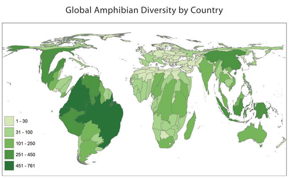 This is a cartogram showing the amphibian concentration in the world. It is definitely not a conventional map, as the countries look skewed, but the map still shows the data.
Isoline Maps

Isoline maps show a representation of a 3 dimensional model with only 2 dimensions. They very quickly communicate the distributions being examined, as with this example of forecast winds.
Hypsometric Contour Map

This is an example of a hypsometric map with contour lines. The information to be gathered at this stage includes cartographic, geological, geotechnical, hydrometeorologic, sedimentometric, environmental and cost data, of regional and local nature.
Nominal Area Choropleth Map
 This is a nominal area choropleth map. It shows political positions of different countries in Africa by using different colors.
Unstandardized Choropleth Map

This is an example of an unstandardized choropleth map. It shows acres of land usage for Hay, Haylage, Grass Silage, and Greenchop in the U.S. in 2002. It is not arielly averaged for each boundary.
Standardized Choropleth Map

This is a standardized choropleth map for population density in the U.S. It's standardized because each boundary(state) is averaged and colored the same. For example, the state of Florida averages out to be in the 200-500 population per square mile range.
Univariate Choropleth Map
 Above is an example of a univariate choropleth map, which represents one set of data. In this case, the different colors represent different levels of poverty in the United States.
Bivariate Choropleth Map
 This bivariate choropleth map uses a pie chart and color differentiations. The information is of land use, life expectancy, and GNP per capita of Africa in 1989.
Unclasses Choropleth Map

This is an example of an unclassed choropleth map. Their aren't specific classes for the data, just a range provided to the right.
Classes Choropleth Map

This is a classes choropleth map of Florida. It shows different colors for different counties in Florida, with different populations of Latino/Hispanics.
Continuously Variable Proportional Circle Map
 This is a continuousely variable proportional circle map of Germany. The circles are used to create point data and are proportional to that data.
Range graded proportional circle map

Above is an example of a range graded proportional circle map, which shows has different size circles for different sets of data. In this case, we are comparing urban populations.

Correlation Matrix

Above is an example of a correlation matrix. The data represents correlations of different investment companies and their returns compared to the returns on the S&P 500 Index.
Similarity Matrix
 Above is an example of a similarity matrix. It shows different similarity colors for the different data sets.
Stem and Leaf Plot

Above is an example of a stem and leaf plot of the infant mortality rates in Western Africa. The data is the number of infant deaths per 1000 births. For example, 14/8 is 148.
Box Plot
 Above is an example of a box plot. The lines on the box plot image above represent the locations of the lowest number, first quartile, second quartile, third quartile and highest number, in relationship to a scale, running from 0 - 140, that pertain to snow depth at a ski resort.
Histogram


A histogram is a graphically display of tabulated frequencies shown in bars. In this case the data shown is test scores for students.
Parallel Coordinate Graph

This is an example of a parallel coordinate graph. It shows multiple sets of data as you can see by all of the information graphed.
Saturday, April 25, 2009
Triangular Plot

This is an example of a triangular plot. The colored areas show regions where major parties would win a majority.
Windrose
 This windrose plot shows different wind knots for locations in Olympia, Washington. The different colors represent different wind speeds.
Climograph
 This climograph shows two different sets of data. It shows the precipitation and temperature for Manaus, Brazil. Climographs can give you a better understanding of climates around the world.
Population Profile

A population profile is a chart showing the number of people as a function of their ages. This profile shows the population of Botswana with and without AIDS.
Friday, April 24, 2009
Scatter Plot
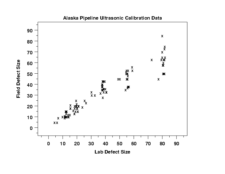 This is an example of a scatter plot. It looks at the Alaskan pipeline and has the raw data plotted first, which is always a good idea.
Index Value Plot

This is an index value plot. It shows different closing values over time, in different countries.
Accumulative Line Graph or Lorenz Curve

 This is an image of a line graph commonly used in geovisualization. This line represents the sediment load into Lake Wado.
Bilateral Graph
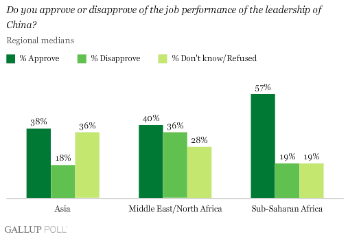
This graph is bilateral because it shows more than one set of information graphed. In this particular example it shows the response of different countries to the job performance of the leadership in China.
Black and white aerial photo

This is a black and white aerial photo of Bloomsberg. It shows in black and white this area very vividly and in a different light.
doppler radar
 This is the doppler radar of Hurricane Frances. This map shows the weather conditions of Florida.
LIDAR

In this instance LIDAR is measuring the terrain of the forest floor and tree heights. It is a much more accurate measure than an aerial photograph.
Infrared Aerial Photos

Infrared film and infrared digital sensors are sensitive to a certain portion of the spectrum of light, and by careful filtration, processing and selection of films, infrared aerials can provide invaluable information. This is a photo of Sacremento's deep water channel.
Dot Density Map
 This is an example of a dot density map that represents the population density of poor people in the U.S. Each dot represents 200 poor persons living in a non-metro area.
Cadastral Map
 This cadastral map shows the real property of Delaware County. It shows specific areas and names within the county.
Propaganda Map

These two maps were an example of Nazi propaganda.They were supposed to have an impact on the morals and intellectual stamina of the people in the Netherlands and France in 1943.
Thematic Map
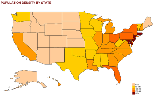 This thematic map shows the population density for specific states in the United States. A thematic map represents a particuliar theme about a geographic area, in this case it is the population density.
Planimetric Map

This is a great example of a planimetric map. It shows a horizontal depiction of map features on a two dimensional plane, without showing any relief like a topographic map.
Monday, April 20, 2009
DOQQ
 This is an example of a Digital Orthophoto Quarter Quadrangle(DOQQ). It takes an aerial photo and then creates the distortion of a map because it is adjusted for relief and camera tilt.
DEM
 This is an example of a Digital Elavation Model. It is a digital representation of the ground surface and topography of Sturgis, SD.
DLG
 This is a good example of a digital line graph(DRG). It is a digital representation of the elavation in the United States.
DRG
 This is an example of a Digital Raster Graphic(DRG). It is a scanned image of USGS series topographic map.
Friday, April 17, 2009
Isotachs

An isotach map has lines that connect points of equal wind speed. In this map, you can see the colors on the top portion of the map that differentiate the wind speeds.
Isobars
 This example of isobars show the different pressure levels in the United States. It is used as a type of weather map.
Isopleths

This is a great example of an isopleth map. It shows statistical data as a third dimension, in this case, amonium ion concentration in the U.S. You can also see how the lines of the same value form circles and don't intersect as with all isopleths.
Isopach
 This map has isopach lines that connect equal true thickness of this area. Isopach maps are used alot with finding oil, and this map is of an oil field.
Isohyetal Map
 This is an example of an Isohyet map. You can see the blue lines that connect the levels of equal precipitation.
Subscribe to:
Comments (Atom)